728x90
프로젝트를 하면서 하이차트 (Highcharts)를 처음 써보게 되었다.
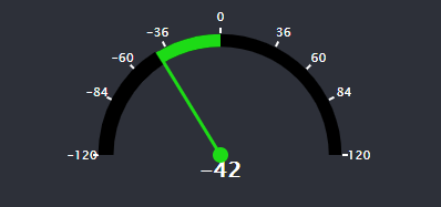
Engine RPM을 표현해야 하는데,
구글링해도 100% 원하는 스타일의 게이지 차트 (Gauge Chart)가 없어서 직접 구현해보았다.
실행결과
소스코드
var gaugeChartOption = {
    chart: {
      plotBackgroundColor: null,
      plotBackgroundImage: null,
      plotBorderWidth: 0,
      plotShadow: false,
      backgroundColor: '#2d3039',
      animation: true
    },
    title: {
      text: null
    },
    tooltip: {
      enabled: false
    },
    pane: {
      startAngle: -90,
      endAngle: 90,
      background: {
        backgroundColor: 'black',
        borderWidth: 0,
        shape: 'arc',
        innerRadius: '85%',
        outerRadius: '95%'
      },
      size: 230,
      center : ["50%", "80%"] //Center Position
    },
    yAxis: {
      stops: [
        [1, '#1DDB16'] // red
      ],
      min: 0,
      max: 900,
      minorTickLength: 0,
      lineWidth: 0,
      tickPixelInterval: 30,
      tickWidth: 2,
      tickPosition: 'inside',
      tickLength: 5,
      tickColor: '#FFFFFF',
      tickPositions: [0, 500, 700, 800, 900],
      labels: {
        distance: 10,
        style: {
          color: "#FFFFFF"
        }
      }
    },
    series: [
    {
      type: 'gauge',
      data: [0],
      pivot: {
        backgroundColor: "#1DDB16",
        borderColor: "#1DDB16",
        borderWidth: 0,
        radius: 7
      }, //Guage 가운데
      dataLabels: {
        y: 50,
        borderWidth: 0,
        style: {
          fontSize: '20px',
          color: "#FFFFFF",
          textOutline: false
        }
      },
      dial: {
        radius: '95%',
        backgroundColor: '#1DDB16',
        borderWidth: 0,
        baseWidth: 3,
        topWidth: 3,
        baseLength: '100%', // of radius
        rearLength: '0%'
      }
    },
    {
      type: 'solidgauge',
      data: [0],
      radius: '95%',
      innerRadius: '85%',
      dataLabels: {
        borderWidth: 0
      }
    },
    {
      type: 'solidgauge',
      data: [0],
      radius: '95%',
      innerRadius: '85%',
      dataLabels: {
        borderWidth: 0
      }
    }
  ],
  navigation: {
    buttonOptions: {
      enabled: false
    }
  },
  credits: {
    style: {
      'display': 'none'
    }
  },
  plotOptions: {
    series: {
      animation: false
    }
  },
};

var chartRpm = Highcharts.chart('container-rpm', gaugeChartOption);

setInterval(function(){
  var maxRPM = 120;
  var engRPM = getRandomArbitrary(maxRPM, maxRPM);

  var stops;
  if (engRPM > 0) {
    stops = [
      [0.5, '#000000'],
      [(maxRPM + engRPM) / (maxRPM * 2), '#1DDB16']
    ];
  }
  else if (engRPM == 0) {
    stops = [
      [0.5, '#000000'],
      [0.5, '#1DDB16']
    ];
  }
  else if (engRPM < 0) {
    stops = [
      [(maxRPM + engRPM) / (maxRPM * 2), '#000000'],
      [0.5, '#1DDB16']
    ];
  }
  else {
    stops = [
      [0.5, '#000000'],
      [0.5, '#1DDB16']
    ];
  }

  chartRpm.yAxis[0].update({
    min: -maxRPM,
    max: maxRPM,
    tickPositions: [
      -maxRPM,
      -(maxRPM * 0.7),
      -(maxRPM * 0.5),
      -(maxRPM * 0.3),
      0,
      maxRPM * 0.3,
      maxRPM * 0.5,
      maxRPM * 0.7, maxRPM],
    stops: stops
  });

  //Gauge Chart Point
  var point = chartRpm.series[0].points[0];
  var point2 = chartRpm.series[1].points[0];
  var point3 = chartRpm.series[2].points[0];

  if (engRPM > 0) {
    point.update(engRPM, false);
    point2.update(engRPM + 0.5);
    point3.update(0);
    chartRpm.series[2].update({
      radius: '96%',
      innerRadius: '84%'
    });
  }
  else if (engRPM == 0) {
    point.update(engRPM, false);
    point2.update(engRPM - 1.5);
    point3.update(engRPM - 1.5);
  }
  else if (engRPM < 0) {
    point.update(engRPM, false);
    point2.update(0);
    point3.update(engRPM - 1);
    chartRpm.series[2].update({
      radius: '96%',
      innerRadius: '84%'
    });
  }
  else if (isNaN(engRPM)) {
    point.update(0, false);
    point2.update(-1.5);
    point3.update(-1.5);
  }
}, 2000);

function getRandomArbitrary(pos, neg) {

  var result;

  result = Math.floor(Math.random() * (pos + neg)) - neg;
  result = result < 0 ? result : result + 1;

  return result;
}
Dial표현은 gauge chart로
영역의 표현은 2개의 solidgauge chart로 구현했다.
아래는 jsfiddle로 구현한 예제이다.
https://jsfiddle.net/GeunChoi/q7gc2h9L/latest/
RPM Gauge Chart - JSFiddle - Code Playground
jsfiddle.net